Design System - The Journey
When we think of a Design System, we often imagine a polished, seamless framework—clean, consistent, and effortlessly efficient. But reality rarely matches the ideal. At Hay2U, our journey to build a design system was anything but tidy—and that’s exactly what made it meaningful.

Role
Product Designer
Clients
Confidential
Industry
E-Commerce
Duration
3 months
Hay2U is...
a platform connecting hay producers and buyers worldwide, creating a global marketplace that bypasses traditional market limitations.

The Challenge:
Time Wasn’t on Our Side
In the early stages, our top priority was meeting tight deadlines and delivering on client expectations. That left no room to invest in a structured design system. As Hay2U scaled, this short-term approach resulted in mounting inconsistencies, slower workflows, and fragmented collaboration.
The Core Issues
Redundant Design Work
Designers were repeatedly creating basic components from scratch, leaving little time for solving more strategic UX problems.
Inconsistent Engineering Output
Without a shared component library, developers implemented their own versions, leading to misalignment and inefficiencies.
Costly Workflow Inefficiencies
50%
of time was spent on rebuilding components
10%
standardized accessibility compliance
20%
estimated profit risk due to poor scalability
Kickstarting
Gaining Buy-In from Stakeholders
To build momentum, we conducted an audit of existing screens and design patterns. The findings were presented in a stakeholder pitch deck, highlighting misalignments and offering concrete recommendations. We emphasized how a well-structured design system would drive both UX quality and operational efficiency.
The Presentation
We began by defining what a design system is and why it matters. Next, we walked stakeholders through an audit of Hay2U’s current UI—pinpointing inconsistencies in spacing, radius, iconography, and color usage. We wrapped up with a proposal outlining a path to improvement and a phased implementation strategy.

The Process
Auditing Existing Layouts and Patterns
With stakeholder alignment, we dived into the real work:

Studying Industry Standards
We researched leading systems like Google’s Material 3, Microsoft’s Fluent UI, and Sainsbury’s Design System. From them, we drew key learnings around naming conventions, component logic, and accessibility best practices.
We also explored Figma Community kits, YouTube breakdowns, and technical blogs for practical insights.
Build or Buy?
We debated whether to build from scratch or customize a third-party system. In the end, we chose to base ours on Microsoft Fluent 2—paired with Figma, Token Studio, and customizations tailored to Hay2U’s brand and product needs.

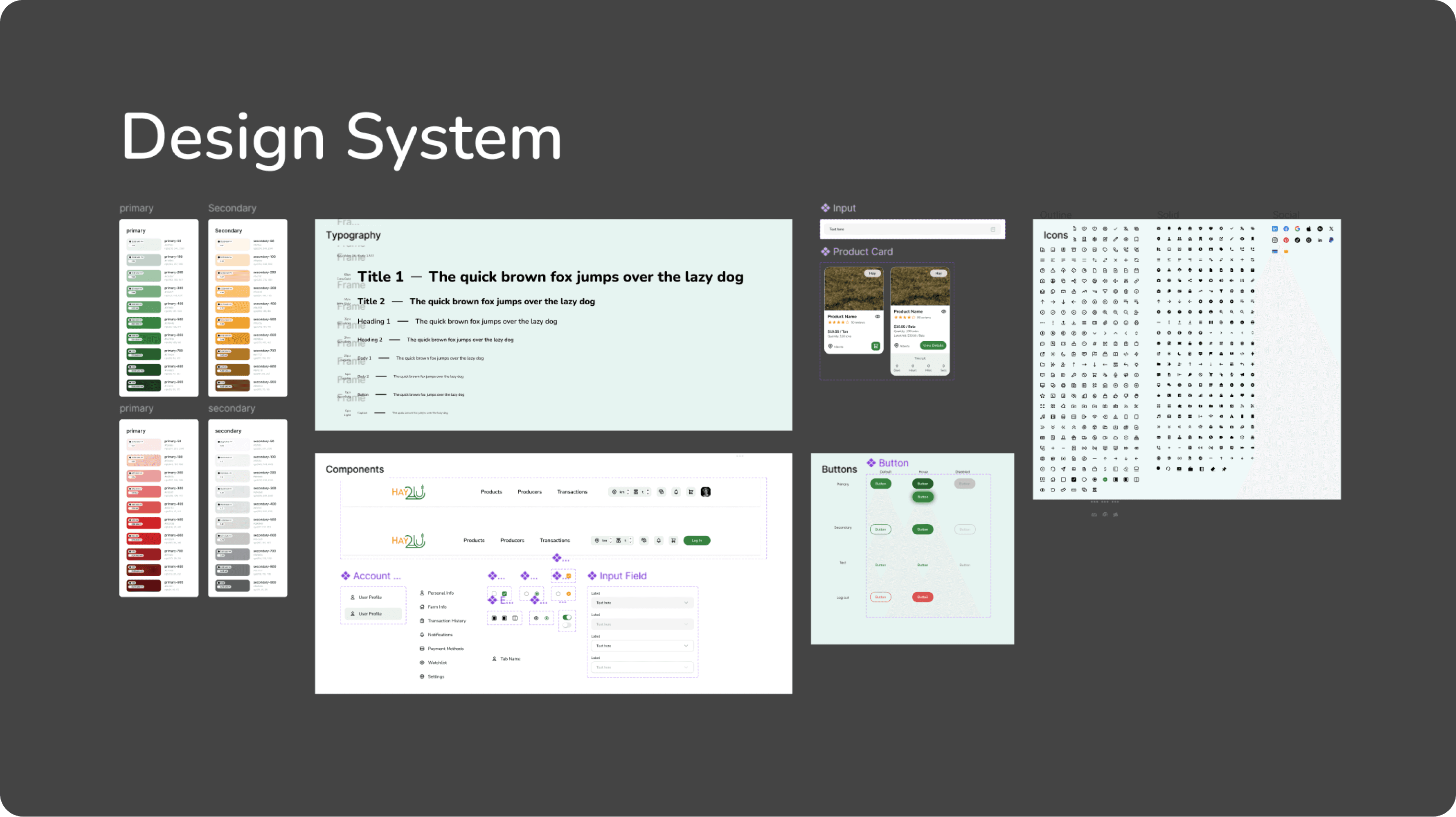
The Foundations of Our System
Accessible, Modern Color Palette
Inspired by our brand, we developed a highly accessible color system with semantic mapping to ensure consistent UI behavior for all users.

Scalable Typography
A responsive type scale using system fonts to ensure fast, adaptable rendering across devices.

Core Attributes
Primitive size, spacing, radius, and shadow were abstracted into tokens to future-proof the system.

Design Grids
We designed website and mobile grids to ensure consistent, efficient, responsive product designs and smoother developer handoffs.

Elevating Design Craftsmanship
User-Friendly Components
Each component included usage documentation and accessibility standards, supporting both designers and developers.


The Outcome
A System That Works—and Inspires
After three focused months, we launched the design system internally. Stakeholders and clients were genuinely impressed. They recognized the potential not just for improved product consistency and development speed, but also for fostering better cross-team collaboration and culture.
Encouraged by the results, stakeholders agreed to expand the design system’s application to upcoming products, including HEPPAI, Atlas, and REFAPP.
Still a Work in Progress
Cross-Functional Testing
Addressing the inconsistencies from independent implementations is a continuous effort. To that end, we're continuously refining our design system through close, cross-functional collaboration with developers. Validating component performance in real use cases is key to ensuring a unified and efficient output.
Ongoing WCAG Compliance
We're a deepening our understanding and implementation of WCAG AA standards to ensure our system meets high accessibility benchmarks for all users.
Complete Documentation
We’re continuing to build out detailed usage and content guidelines—especially in areas designers often overlook.
Reflections & Learnings
Storytelling is Powerful
Data alone rarely wins hearts. But paired with narrative, it can drive real decision-making and alignment.
Perfection Isn’t the Goal
Our design system journey has been messy, human, and rewarding. It taught us that growth often comes from embracing imperfections and solving problems as they arise—together.
